



Case study
Vodaland USA
Vodaland USA is a manufacturer specializing in engineered drainage, water management, and terrain development systems for both commercial and residential applications. The company designs and produces solutions like trench drains, permeable pavers, erosion control systems, and oil-water separators used in construction and infrastructure projects. With over 20 years of experience and in-house manufacturing, it focuses on delivering durable, precision-engineered products directly to contractors and builders.
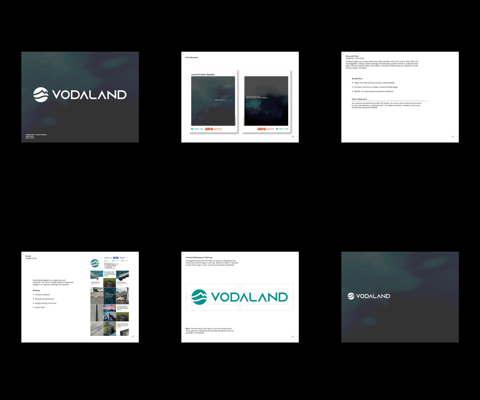
Vodaland USA was already a strong industry leader, but its visual identity relied too heavily on bright tone, playful execution, and 3D renders that lacked realism and authority. The goal of this evolution was not to rebrand, but to mature the system into something that better reflects the precision, seriousness, and expertise of the product.
The brand voice now positions Vodaland as a trusted expert and creative problem solver: direct, clear, and refreshingly uninterested in overcomplicating things. It takes complex drainage and landscaping systems and makes them feel simple, logical, and dare we say normal.
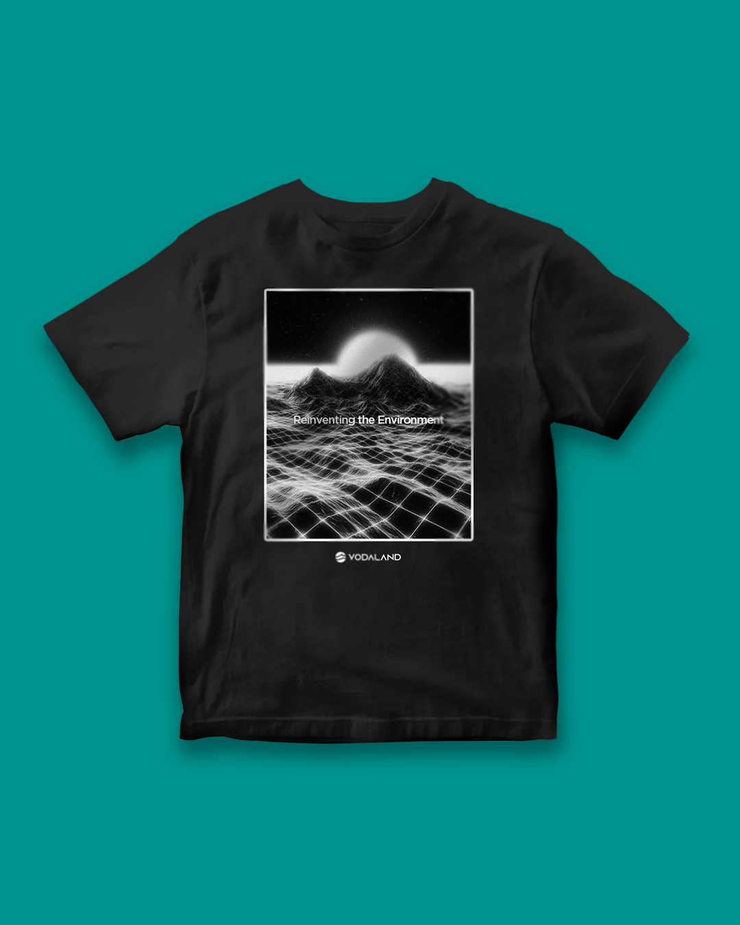
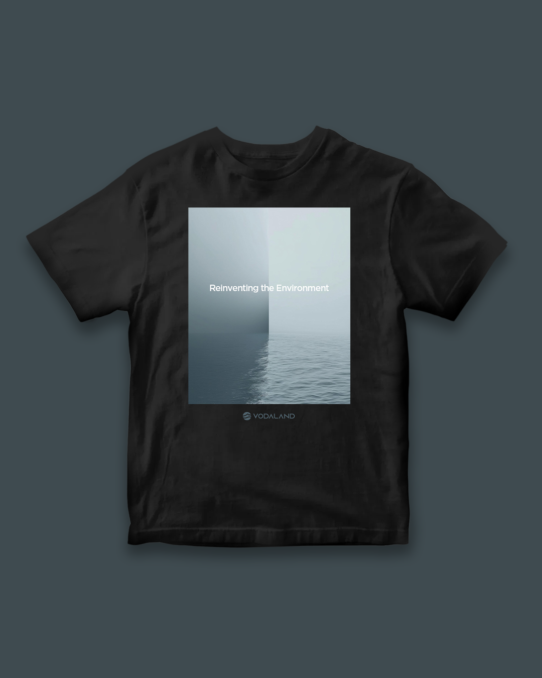
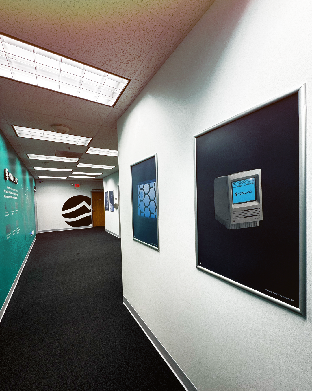
Visually, things got a much-needed diet. The palette moved to black, grey, and white, with the signature green finally demoted to “supporting character” instead of main event. Typography was upgraded to something timeless and clean—built to last longer than current design trends.
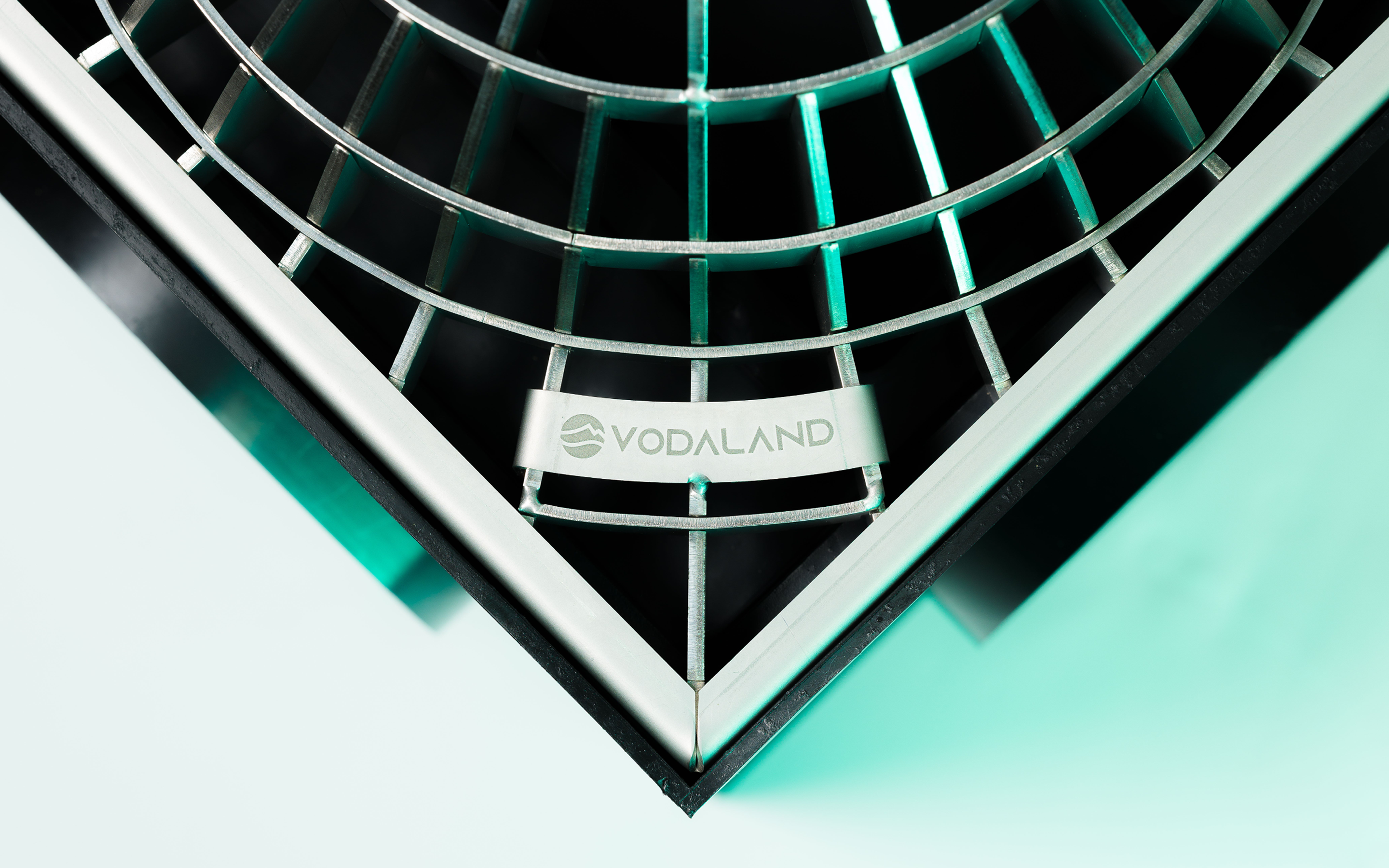
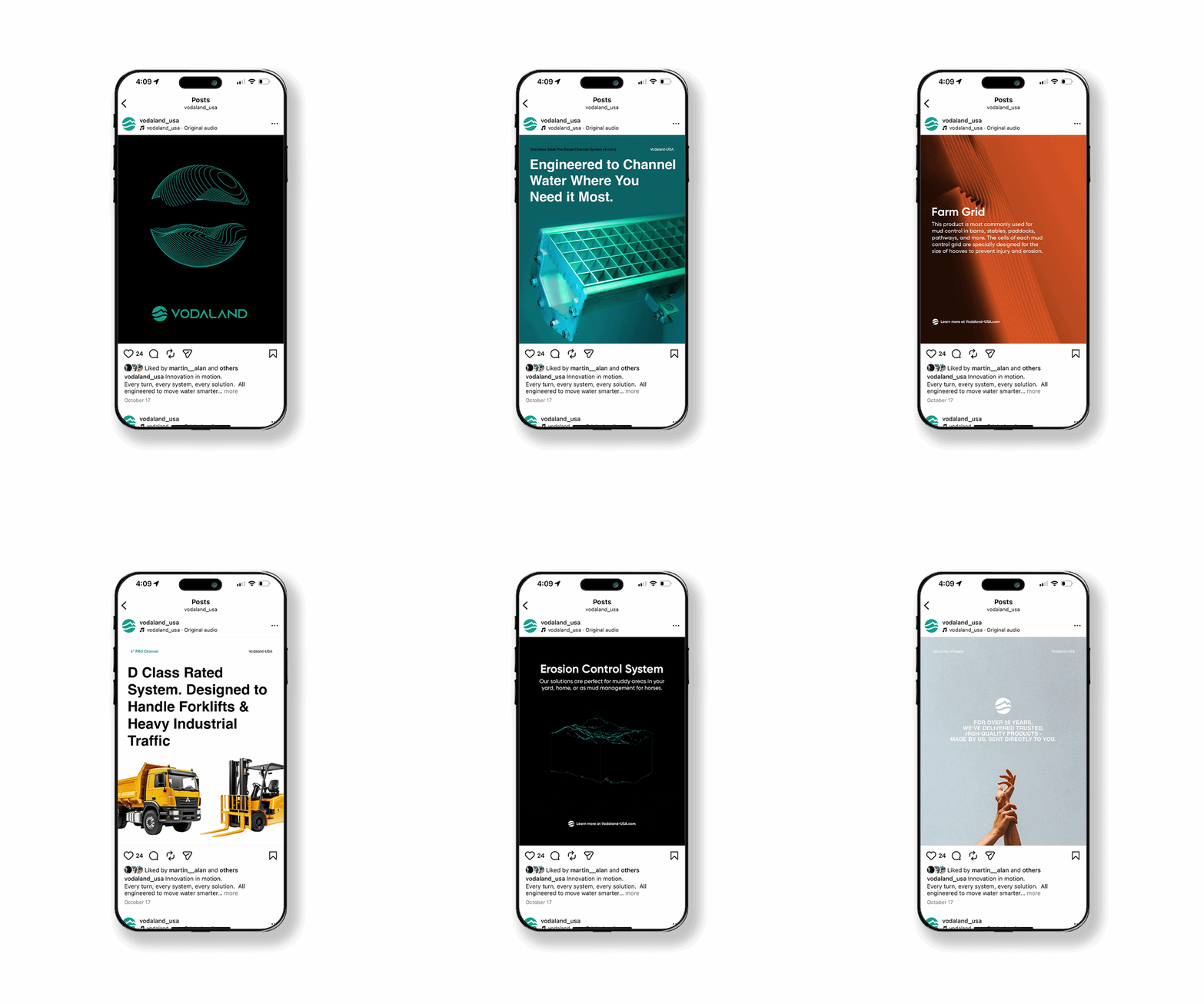
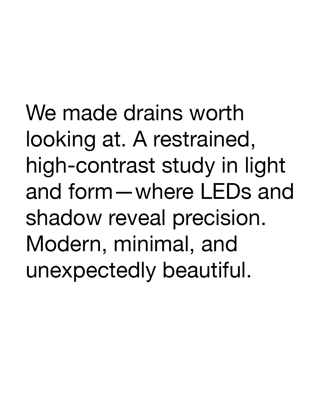
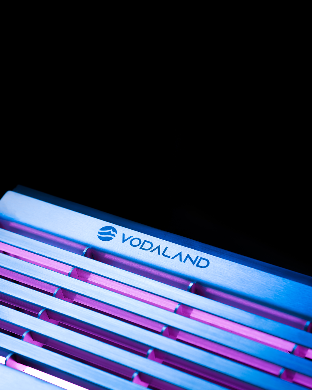
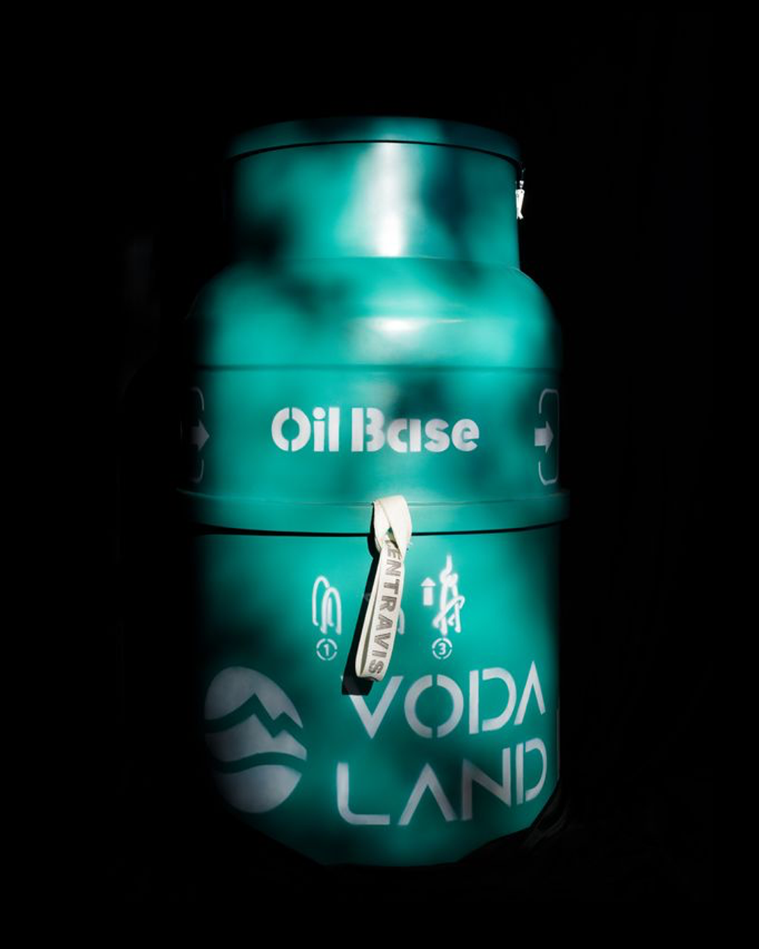
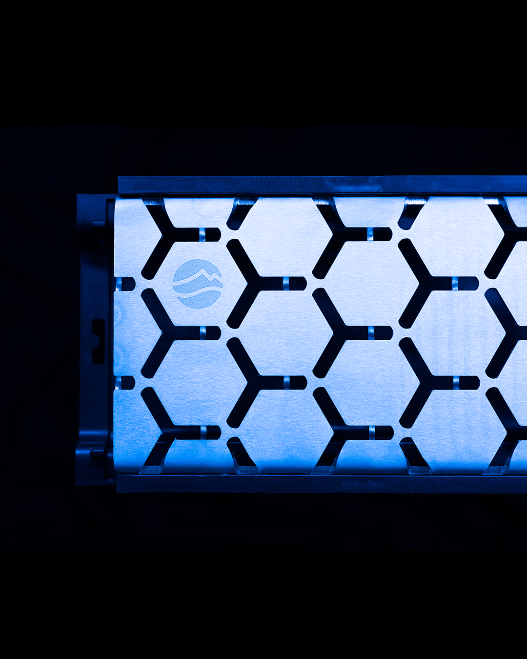
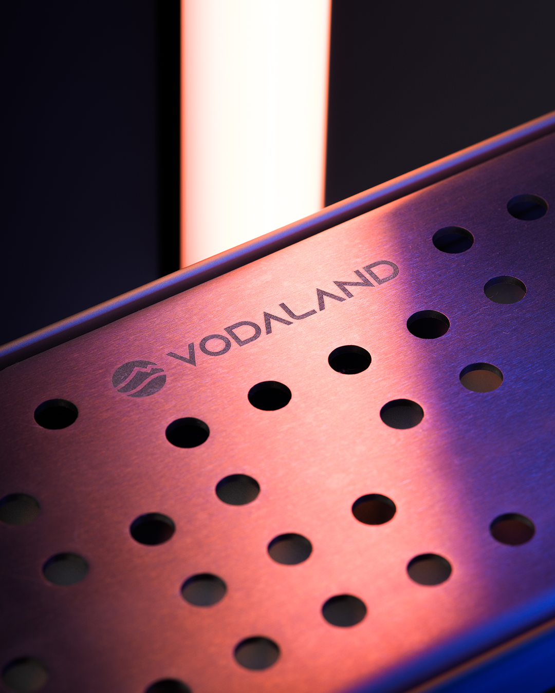
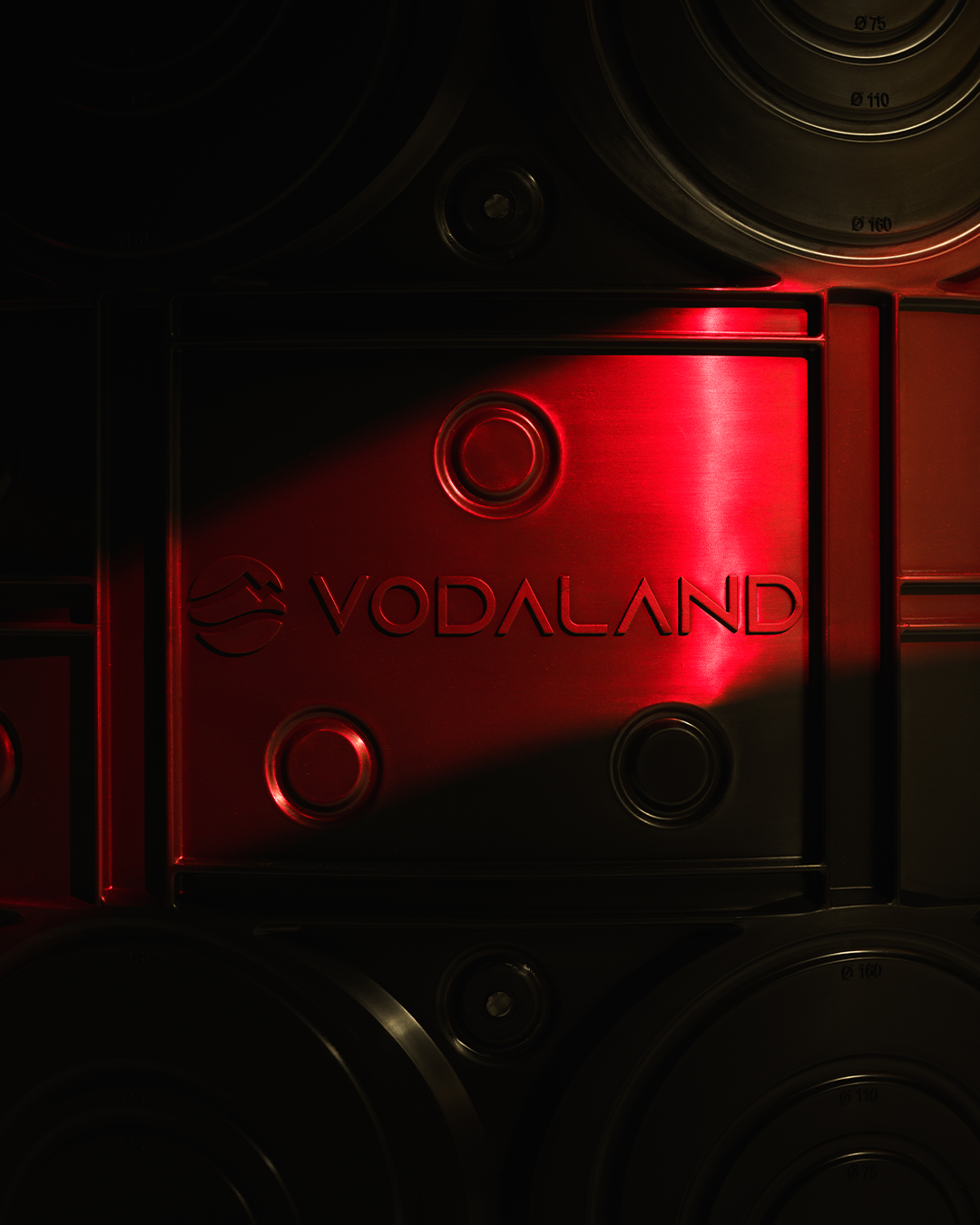
Photography is where things really changed. Instead of glossy renders, we leaned into darker, more serious. Then we added subtle LED lighting to highlight precision and detail—because apparently drainage systems can look cinematic if you try hard enough. Competitors are still figuring that part out.
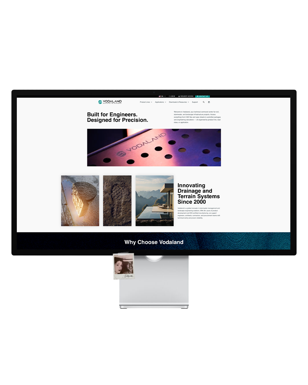
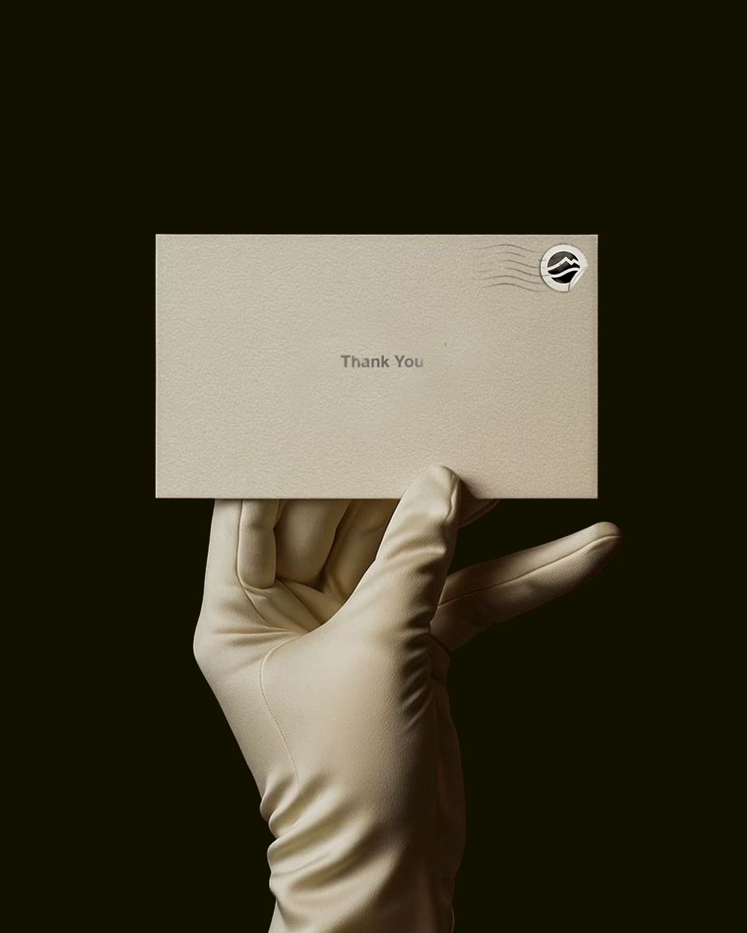
Across web and social, everything tightened up. The website now actually helps users instead of visually shouting at them, and social content feels more intimate—less “product billboard,” more “we know what we’re talking about and you can trust us.”
The result is a more confident Vodaland: less neon enthusiasm, more engineered restraint, and a brand that finally looks like it knows exactly what it’s doing.

Managing Partner: Martin Bachert
Marketing Manager: Dylan Clark
Creative Director / Designer: Patrick Woodling
Photography / Videography: Nathaniel Rolland