
Case study
Heylo Health
Heylo Health creates clean, thoughtfully formulated supplements designed to support the body as a connected system. Rooted in transparency, restraint, and science, every product is built with purpose—using effective ingredients at meaningful doses, clearly labeled and carefully tested. Heylo focuses on what matters most: supporting real health outcomes while removing unnecessary additives, distractions, and exaggerated claims.
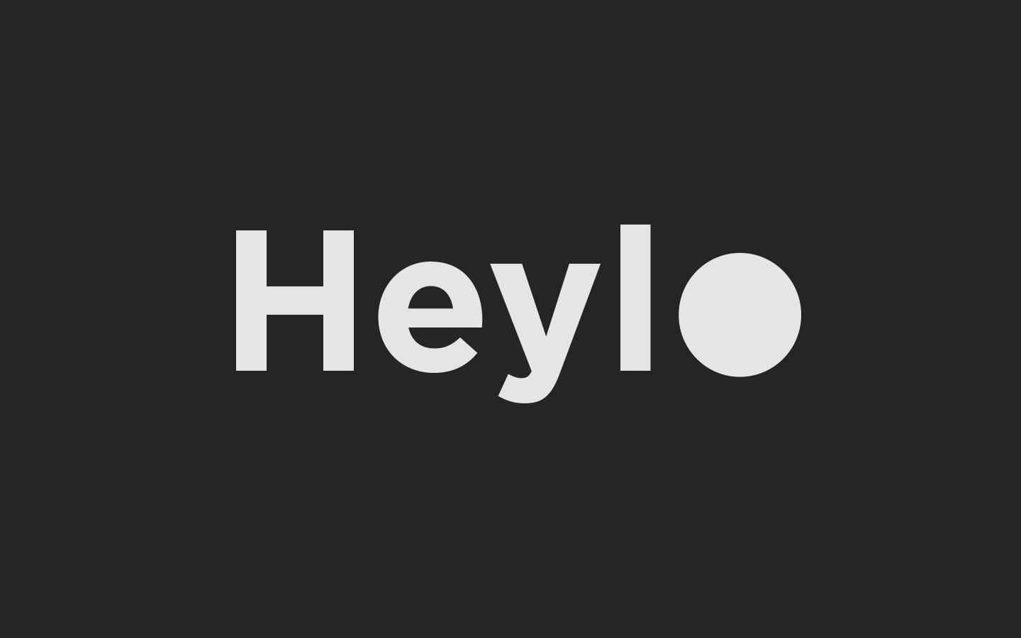
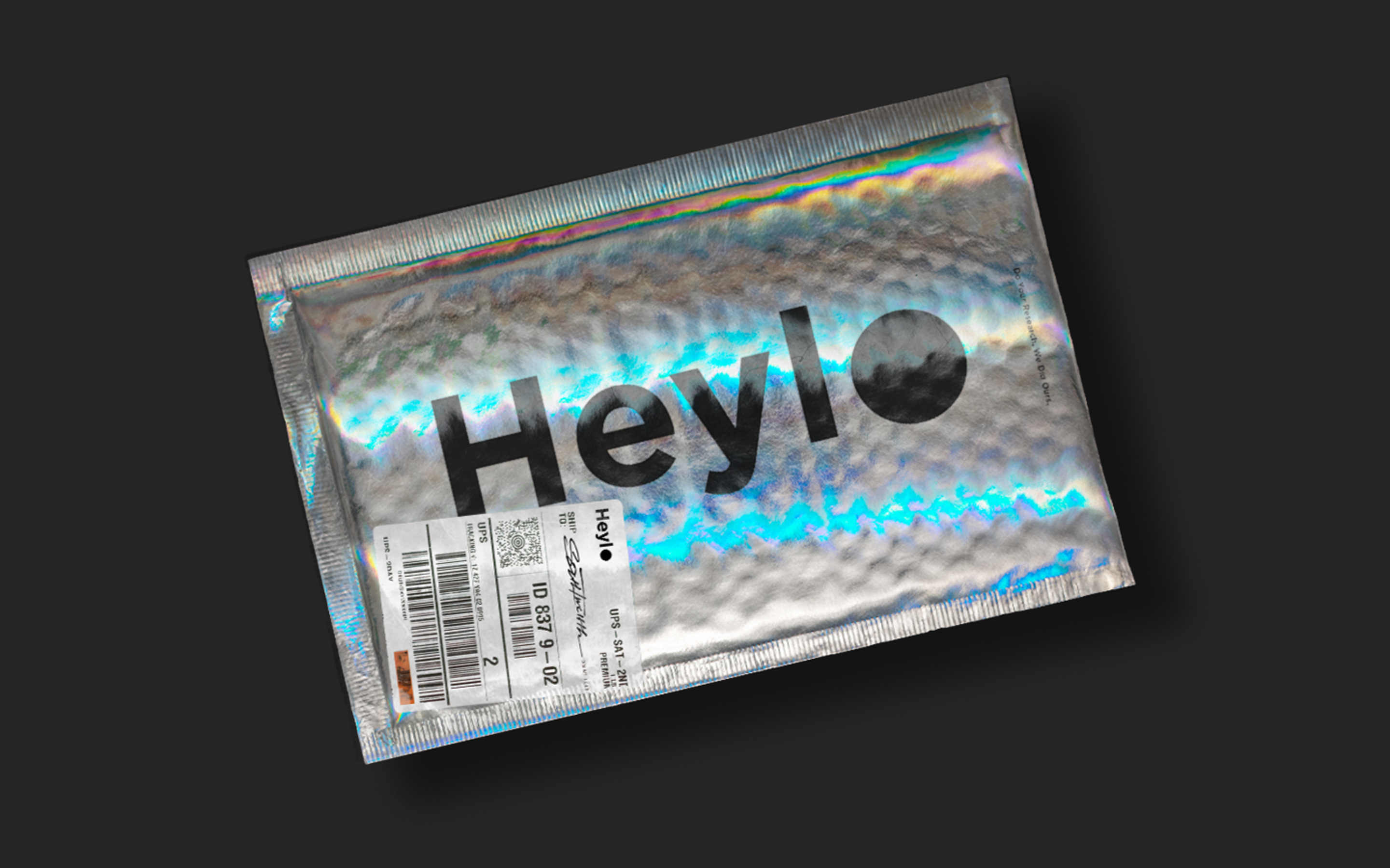
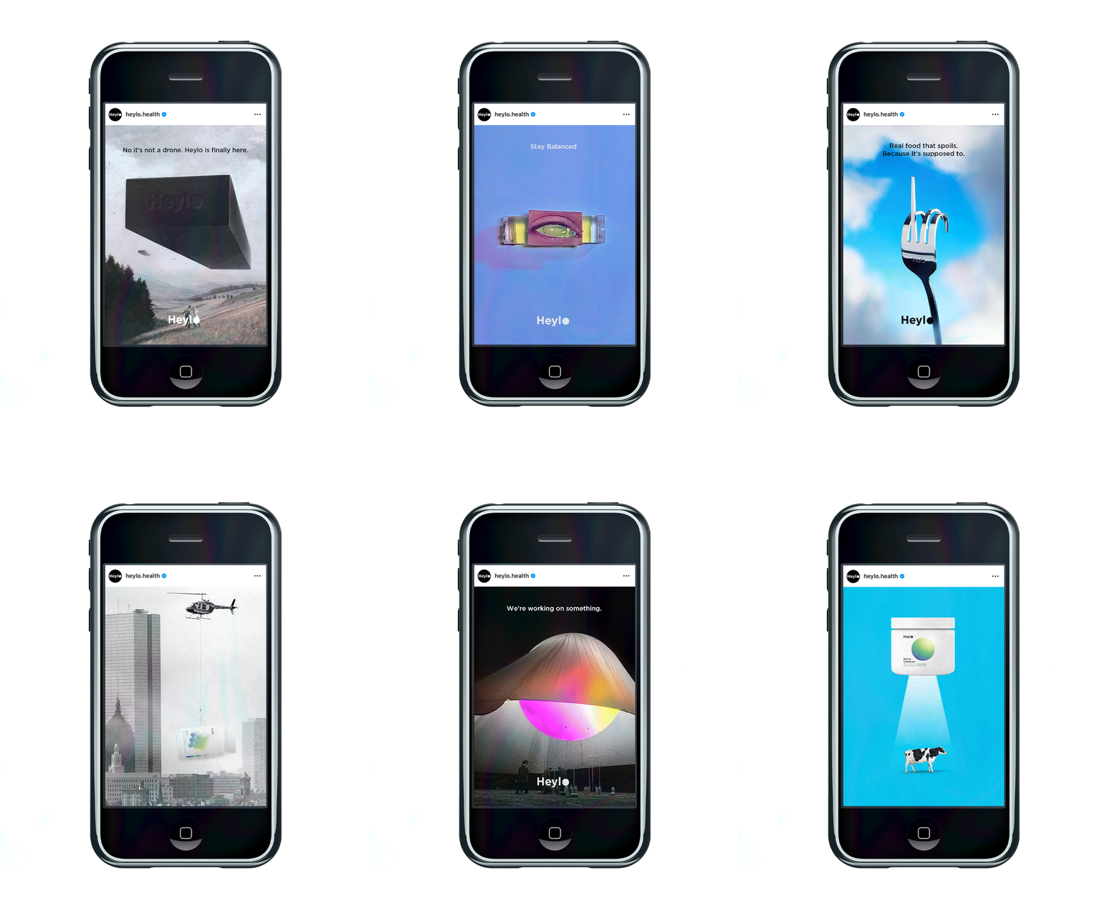
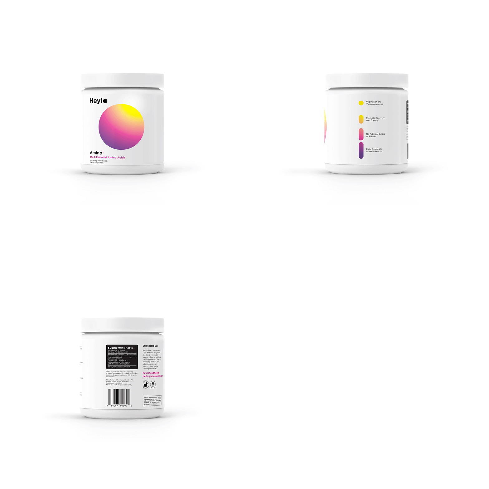
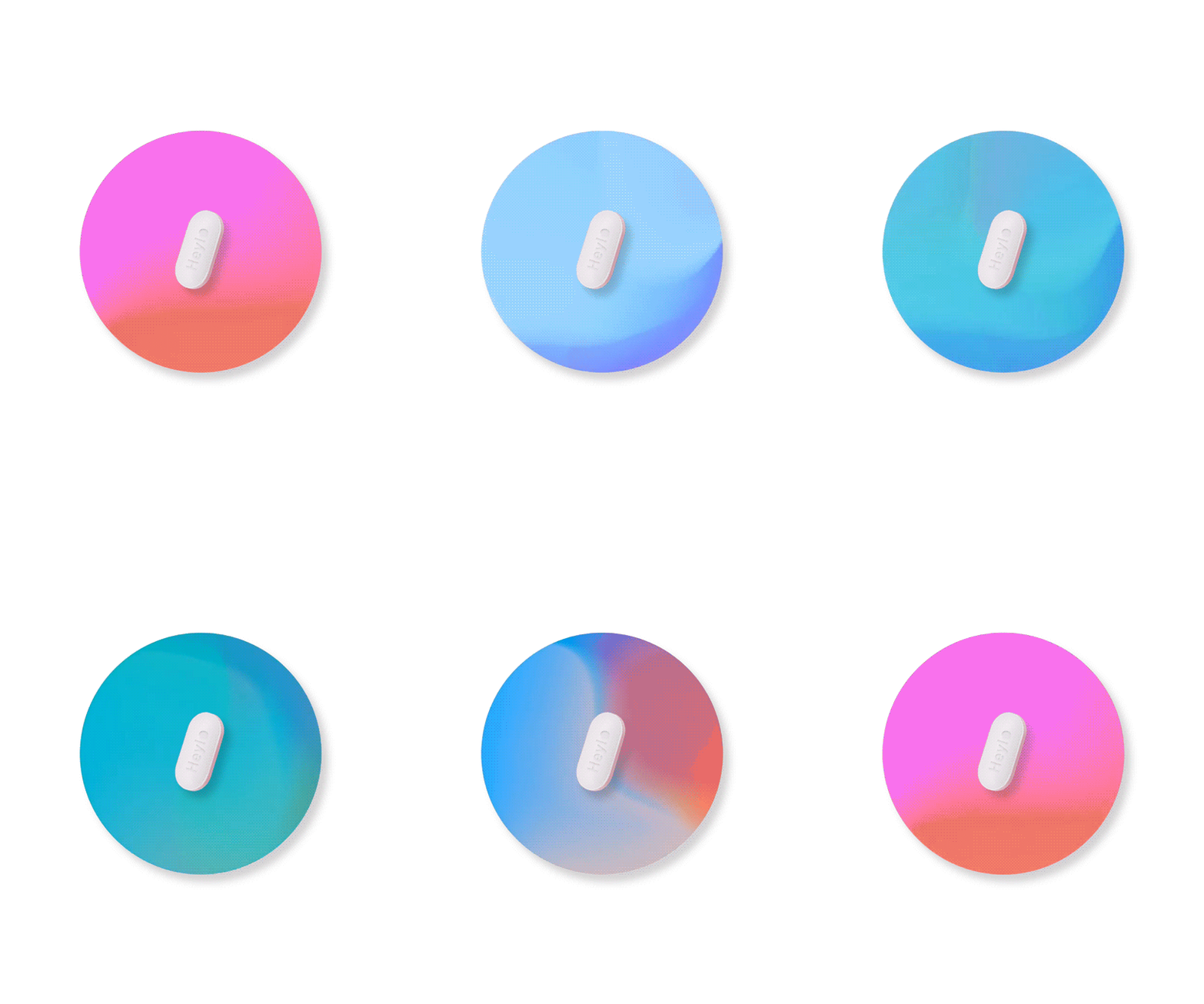
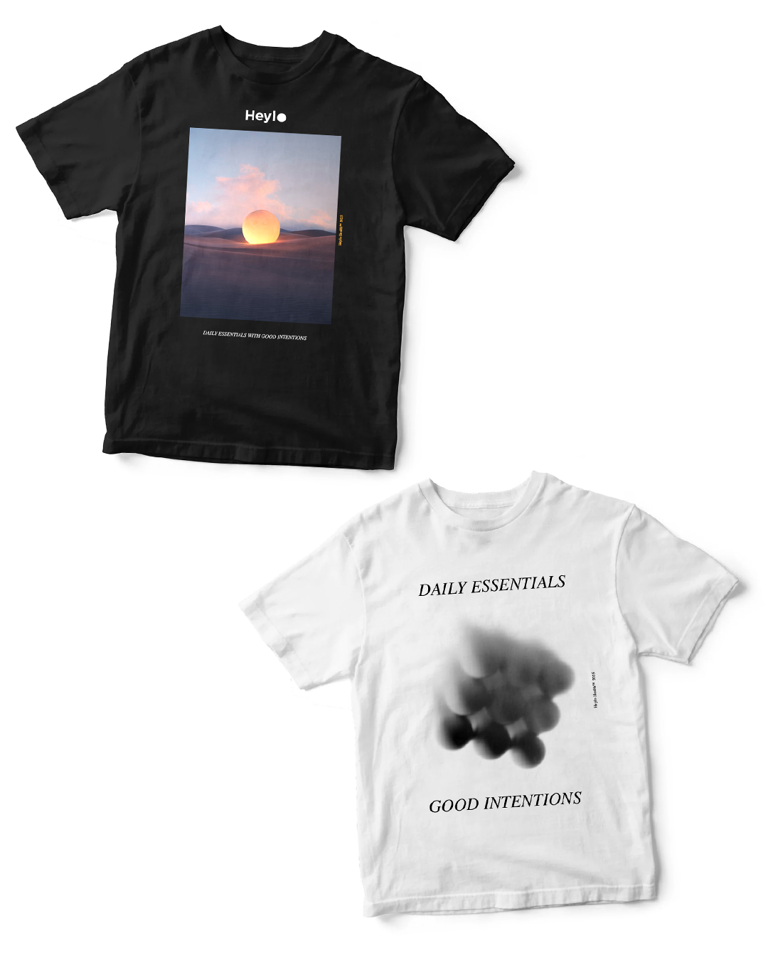
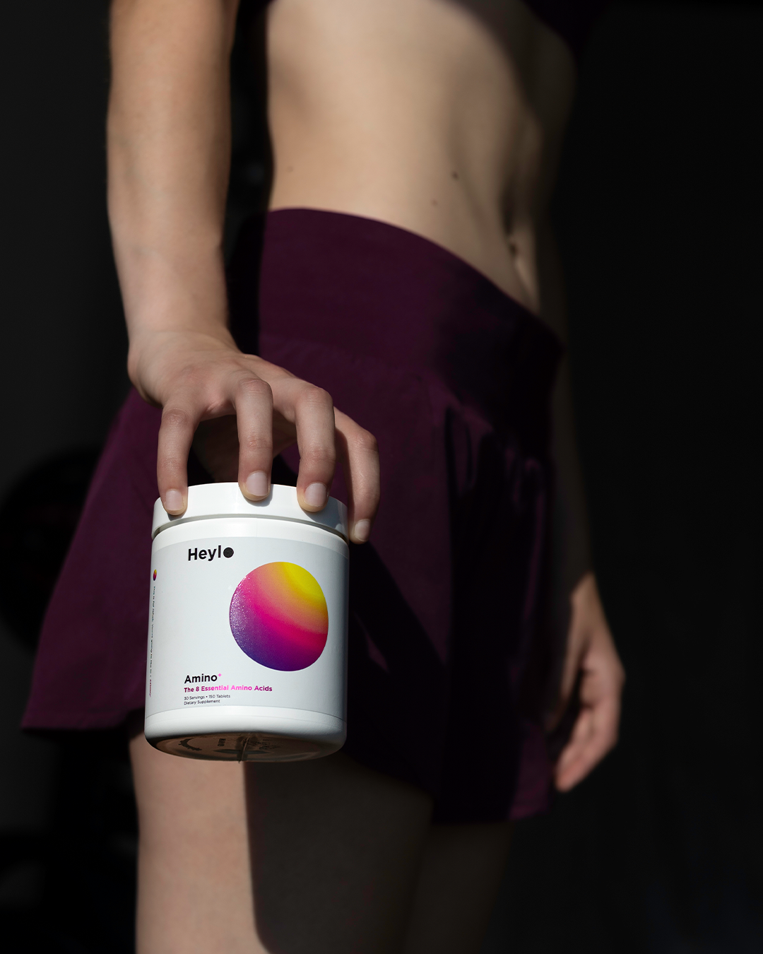
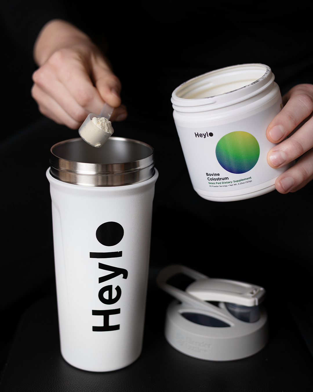
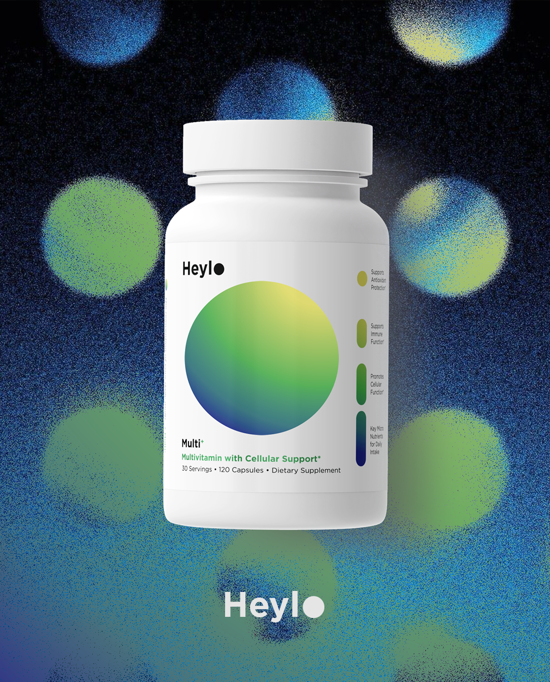
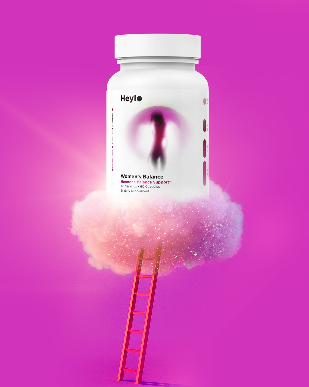
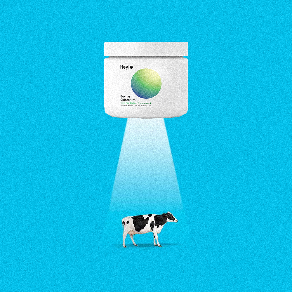
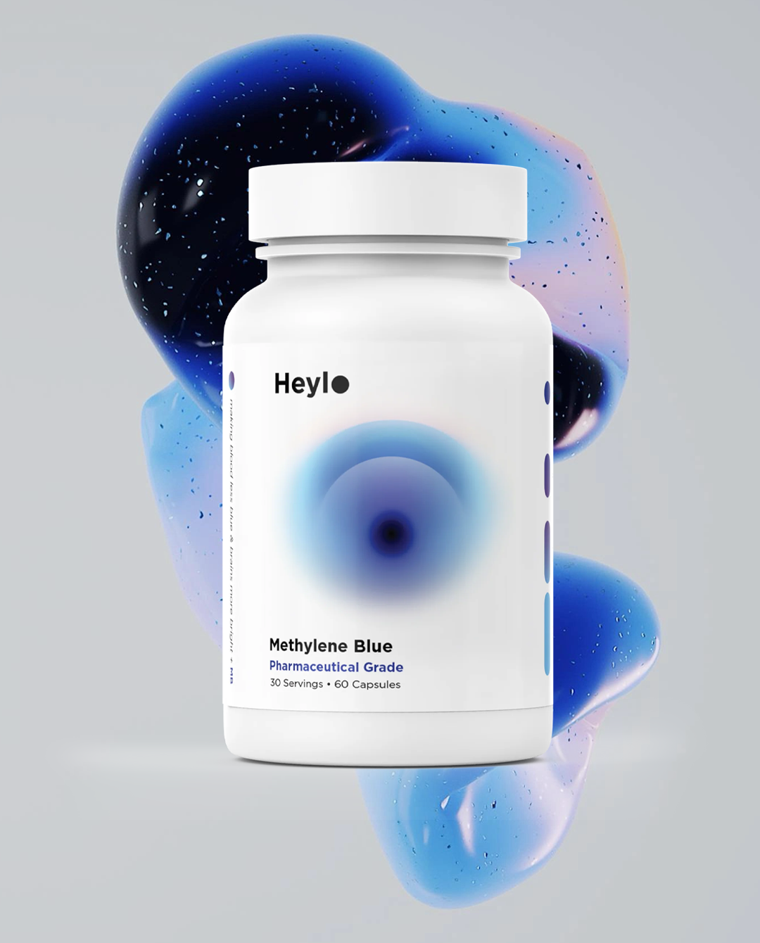
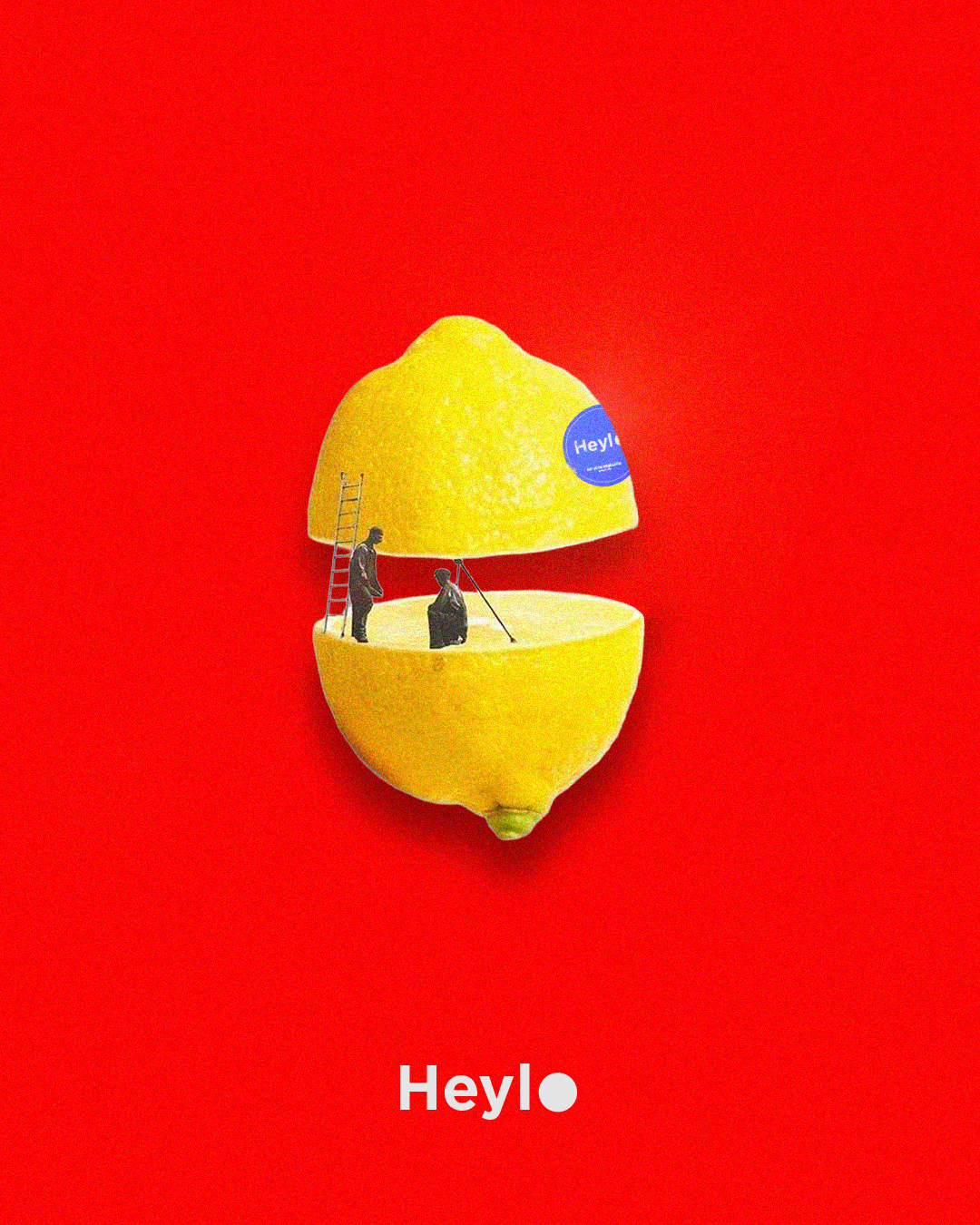
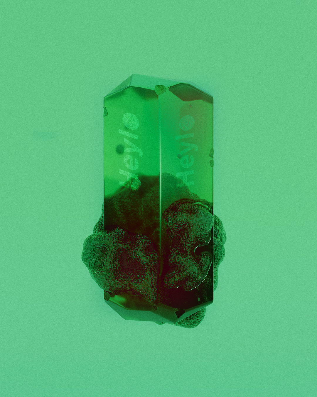
The visual identity for Heylo Health was designed to feel clear, intentional, quietly confident, with a touch of humor. At the center of the brand is a custom wordmark, anchored by a solid, circular “O.” This mark serves as a minimalistic halo: a symbol of balance, wholeness, and clarity. Not the glowing, over-the-top kind, more the “you’ve got your life together” kind. That halo is not confined to the wordmark. It carries through the entire identity as a recurring circular motif, appearing across packaging, layouts, and social media. Circular forms provide structure and consistency, allowing the identity to function without explanation. The typography reinforces this mindset. The Gotham typeface is clean, straightforward, subtle, with a bold structure, and distinct weight. It’s highly legible and feels confident without being aggressive. And all honesty, I primarily use the same five fonts for most brands I design from scratch. Visually, the brand captures a sense of curiosity, quiet optimism, a hint of sarcasm —the wonder of self-discovery, the excitement of personal transformation, and the reassurance that progress doesn’t have to be complicated. I created this identity to cut through the noise of an overcrowded wellness space, where everything claims to be revolutionary.

Managing Partner: Martin Bachert
Managing Partner: Zach Plackemeier
Paid Media: Jesse Cosper
Creative Director / Designer: Patrick Woodling
Project Manager: John Winkler
Photography / Videography: Nathaniel Rolland
Copy Writing: Dominic Vaiana
American Advertising Federation 2026: Brand Campaign, Logo (Submission)